IS Reading Inhabitations

A response to the lecture series for Studio: Inhabitations Semester 1, 2014

Month: June, 2014

Week 3: The History of the Bedroom

As there are a multitude of different bedroom histories I have decided to focus on history of the English bedroom. The bedroom has developed greatly over the years, never changing in purpose but constantly changing as a social space.

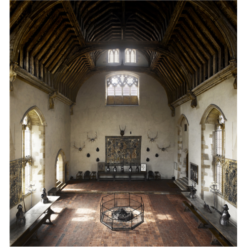
In medieval times the bedroom was a public and social space. The word ‘bedroom’ did not even exist. During these times all of the people who lived and worked on a property would sleep in the great hall owned by the Master of the property. This hall was a multipurpose space used for many different activities such as dining, working and sleeping. The idea of the bedroom developed during this time as the chamber. The Master and Mistress of the property would have a chamber room above the great hall. This chamber room was used as a sleeping quarters, but also used for dining and entertaining. It was not a private space, but a public space for select people, such as the Master and Mistresses’ family and close servants. This room was truly one of social hierarchy as it had a window that enabled the family to ‘look down’ on the plebeians.

fig. 1: The Great Hall of Penshurst Place, England, from the vantage point of the chambers

fig. 1: The Great Hall of Penshurst Place, England, from the vantage point of the chambers


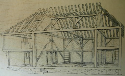
As we move to the Tudor era, a new class of people emerged. These people were called ‘middlings’ and were basically today’s equivalent of middle class. These people built their homes with bedchambers on the second level of the home. This room was a shared bedroom, and was still very much a public space. All people of the house, including servants, would sleep in these quarters, sometimes even on the same bed. This is also when the first proper beds started to emerge. Beds were often the most expensive item that a household owned, and were probably the most private part of the room, as the main bed would have curtains to provide little privacy for the couple of the household. If the couple wanted to engage in carnal relations, they would often have to wake in the middle of the night to have more privacy.

fig. 2: A typical Tudor home, owned by a 'middling' family

fig. 2: A typical Tudor home, owned by a ‘middling’ family


fig. 3: Inside a Tudor home - note the upstairs area, used for communal sleeping.

fig. 3: Inside a Tudor home – note the upstairs area, used for communal sleeping.


The 17th Century saw the bedroom become a larger space, yet still strangely public. In the Royal Family, the King and Queen would have their own private bedrooms, however, each morning both would be ceremoniously dressed in these rooms in front of an audience. The dressing ceremony was extremely hierarchical, with specific roles for each dresser. At the bottom of the dressing hierarchy was the ‘Page’ who would put on the Queen’s shoes. They would also entertain in their bedrooms, hosting small parties of people. The only time when their bedroom would be intimately private would be if the King were to visit the Queen’s room. This would never happen the other way around. Lower class people copied these practices by entertaining in their bedchambers and having public occasions such as marriages held in their bedrooms. The first truly private space emerged soon after, in the form of a closet. The Royal family and some wealthy aristocrats owned these. Closets were rooms off the public bedroom that were purely private and locked up by the owner. These closets were a manifestation of the owner’s personality and taste. For more common people, bedrooms were all linked to one another, and one would have to pass through one or two bedrooms to reach their own. In the Victorian era, however, the corridor was introduced to create privacy.

From the beginning of the bedroom until the Victorian era, the bedroom was a central place of the household and of the occupant’s lives. Often a person would be born in the bedroom, sleep in the bedroom, get married in the bedroom, give birth in the bedroom and die in the bedroom. However in the Victorian era, couples had their own bedroom, and bedrooms were seen as places that were strictly for sleeping (this rule did not apply to aristocratic or royal households). The industrial revolution allowed some people to indulge in the amount of rooms they created in their homes. For some wealthy industrialists, the couples had separate bedroom connected by a door. The husband’s room was referred to as the ‘dressing room’ and had another separate door that opened to the outside so that the husband could sneak back home after a night out and not disturb his sleeping wife. During the Victorian era, private bedrooms became more popular, however it wasnt until the Georgian era’s expanding economy that a private bedroom was a normality.


fig. 4: A bedroom of an aristocrat, used for entertaining in the

fig. 4: A bedroom of an aristocrat at Woburn Abbey used for entertaining. Typical of the Victorian Era.


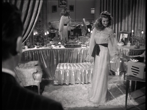
In the 1930’s we see the emergence of the ‘boudoir’, brought on by the Hollywood culture and the emancipation of women. This turns the bedroom back into a space that is a slightly more public, multifunctional room. We see the desk returning to the bedroom and books being read in bed, which was probably done in the Victorian era, but widely frowned upon. It was during this time that people truly had their own private space, and were able to do whatever they pleased in their personal bedrooms. In the 1950’s the twin set beds became popular. They were a small step into the future, but paid homage to the Victorian predecessor of the luxury of having one’s own bed. It wasn’t until after the 50’s that it was common for couples to not only share a room, but to share a bed together as well.

fig. 5: The 1930's boudior, depicted in a Hollywood film.

fig. 5: The 1930’s boudior, depicted in a Hollywood film.


The typical 1950's twin bed arrangement, as seen on popular tv show 'I Love Lucy'

fig. 6: The typical 1950’s twin bed arrangement, as seen on popular tv show ‘I Love Lucy’


Although the bedroom has not changed its fundamental purpose over the years, it has seen a great change in terms of its social purpose. From the extremely public bedroom of the medieval times, to the extremely private bedroom of the Victorian era, it has now found a happy medium between the two where it can exist as a private sanctuary for its owner, but also as a representation to the world of ones own personality.

References:

If Walls Could Talk: The History of the Home: The Bedroom, dir. Lucy Worsley (BBC, 2011)

Tyrrell-Lewis Associates, Social History, Bricks and Brass, 2001-2014 <http://www.bricksandbrass.co.uk/design_by_room/bedroom/bedroom_social_history.php&gt;

James Duncan, Sleeping Around: A History of the Bedroom, James Duncan/Disciplined Eclecticism, 30 December 2010 <http://www.jamesstuartduncan.com/collections/2013/12/30/sleeping-around-a-history-of-the-bedroom&gt;

Images:

fig. 1:

Alan Jacobs, Penshurst Place, The American Conservative, 8 January 2013 <http://www.theamericanconservative.com/jacobs/penshurst-place/&gt;

fig. 2 & 3:

Mandy Barrow, Characteristics of Tudor Houses, Houses and Homes <http://resources.woodlands-junior.kent.sch.uk/homework/houses/tudors/characteristics.htm&gt;

fig. 4:

Classic British Hotels, Woburn Abbey, 2013 <http://treasurehouses.classicbritishhotels.com/woburn-abbey/&gt;

fig. 5:

Charles Vidor, Occurrence, Shadowplay, 23 August 2011 <https://dcairns.wordpress.com/tag/charles-vidor/&gt;

fig. 6:

Luke Ferris, Top 5 Furniture in TV History, Worldstage, 30 April 2014 <http://blisstree-2012-stage.com/2014/04/top-5-furniture-in-tv-history/&gt;


Week 11: In Praise of Shadows

The ideals of Modernist space differ greatly to those of traditional Japanese space. For this entry, I will be looking at Junichiro Tanizaki’s ‘In Praise of Shadows’ in the light of quotes about the transparency of modernism by Sigfried Gideon and Walter Benjamin.


‘Le Corbusier’s houses define themselves neither by space nor by forms: the air passes right through them! The air becomes a constitutive factor! For this, one should count neither on space nor forms, but uniquely on relation and co-penetration! There is only a single, indivisible space. The separations between interior and exterior fall’– Sigfreid Gideon


‘To live in a glass house is a revolutionary virtue par excellence. It is also an intoxication, a moral exhibitionism that we badly need’ Walter Benjamin


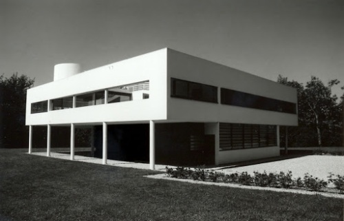
Before I look at the relationship between these quotes and Tanizaki’s work, I’m going to look at the architecture of Le Corbusier. Le Corbusier is one of the most classic examples of a modernist architect and his modernist style is manifested in the Villa Savoye (fig.1). The open plan of the building diminishes the constraints of public and private space as described by Gideon and Benjamin. This is further exaggerated by the large glass doors (fig. 2) that open onto the courtyard, eliminating the barrier between the outdoors and indoors. The ribbon windows that float at eye level around the building also help to connect the inhabitant with the outdoors further eliminating the barriers between the interior and the exterior. It is this relationship between the public and private, exterior and interior that creates the transparency of modernist architecture. Tanizaki, on the other hand, looks at traditional Japanese architecture and the importance of the separation between public and private spheres and therefore the solidity of Japanese architecture. This is most evident when Tanizaki talks about the Japanese toilet as it stands apart from the main building, creating a ‘place of spiritual repose’. The practicality of a private and much separated area is that it relaxes the inhabitant, enabling them to have a better bathroom experience, but it also addresses the issue of hygiene, especially before the times of modern technology.


fig.1: The Villa Savoye 1931 by Le Corbusier, in Poissy, France

fig.1: The Villa Savoye 1931 by Le Corbusier, in Poissy, France


fig. 2: The large glass doors that open onto the courtyard. Also note the ribbon windows that allow break the barrier between interior and exterior.

fig. 2: The large glass doors that open onto the courtyard. Also note the ribbon windows that allow break the barrier between interior and exterior.

I think that it is also interesting to look at the contrast between the modernist example of the Villa Savoye and Tanizaki’s work as a comparison of materiality. The Villa Savoye’s materials are supposed to be of the utmost practicality, using glass, concrete and metal. Although practical, it is interesting to note that the original occupants deemed the Villa Savoye as uninhabitable and that these materials needed constant maintenance. The aesthetic of the modern interior is to be maintained to uphold its beauty. Benjamin’s quote also touches on the materiality of modern architecture, and the importance of glass in the breakdown of the public and private spheres and the flooding of light into a space through the glass which again highlights the strong modernist desire to create a transparent inhabitation. The Japanese interior, however, is completely opposite and designed to age. Aging adds to its beauty, a ‘tarnish so patiently waited for’. This is idea is based around the atmospheric qualities that traditional Japanese materials uphold such as the ‘softness and warmth of paper’ and the tactility and mystery of a deep and dark ceramic soup bowl. He also talks about the importance of the shadow and darkness in creating an experience in space that has far more depth than that of brightly lit modernist architecture. He suggests that the modern or western aesthetic does not compare to the atmosphere created by the traditional Japanese.

fig. 3: The shadows in the corridor of Zuiryu Ji Temple, Toyama, Japan.

fig. 3: The shadows in the corridor of Zuiryu Ji Temple, Toyama, Japan.


Although Tanizaki suggests that there are some benefits of modernity, it can be concluded that the transparency of modernist architecture is ironically impractical, as public and private spheres need to exist to satisfy the inhabitant’s needs. Similarly, the choice of material, and the allowance of shadows also contribute to the satisfaction of the inhabitant and should not be overshadowed by the desire to modernize.


References:
Junichiro Tanizaki, In Praise of Shadows, (Sedgwick, U.S.A., Leete’s Island Books, 1977).


Images:
fig. 1:

Gabriel D’yvoire, Minimalist Exposition, 21 July 2010 <http://minimalexposition.blogspot.com.au/2010/07/gabriel-dyvoire-villa-savoye-details.html>


fig. 2:

Peter Buchanan, THE BIG RETHINK PART 2: FAREWELL TO MODERNISM − AND MODERNITY TOO, Architectural Review, 30 January 2012 <http://www.architectural-review.com/essays/the-big-rethink-part-2-farewell-to-modernism-and-modernity-too/8625733.article>

fig. 3:

Impress Japan Corporation, GANREF, 2014 <http://ganref.jp/m/umetaro/portfolios/photo_detail/811f8bbd079df537cd6c180a4f6785d5>

Week 1: Architectural Notation and the Importance of Inhabitation and Time

As a designer it is important to consider the human form and the role of time whilst creating a space for inhabitation. In week 1 we looked at the static architectural notation and its insufficiency for the task of representing space and therefore designing inhabited space.

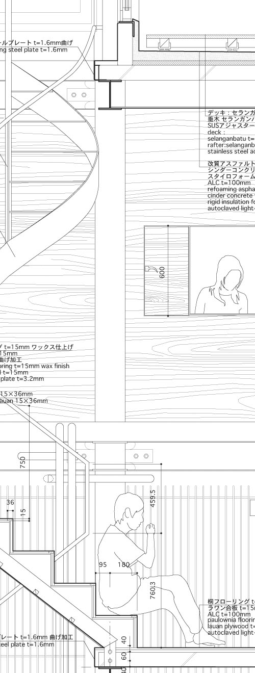
fig. 1: A perspective drawing from Atelier Bow-Wow's 'Graphic Anatomy'

fig. 1: A perspective drawing from Atelier Bow-Wow’s ‘Graphic Anatomy’


The role of the inhabitant is a crucial element to designing inhabited space and therefore it is imperative that we consider the inhabitant occupying the space in architectural documentation. ‘The narrative of place’ as explained by Pallasmaa, is extremely important as it enables us to connect with space, and project our own ideas of inhabitation onto the space. This idea can be executed by including forms that we recognise in documented space to get a deeper sense of how the space works, the scale of the space and the atmosphere that it may possess. Atelier Bow-Wow’s drawings are immaculate examples of how the documentation of figures allows the viewer to properly read the space.

fig. 2: A second perspective drawing from Atelier Bow-Wow's 'Graphic Anatomy'

fig. 2: A second perspective drawing from Atelier Bow-Wow’s ‘Graphic Anatomy’


In fig. 1 you can see that the small injection of furniture, and the central figures using the study, which allows the reader to instantly see the scale of the space and it’s purpose. These ideas are also supported by text. Similarly, fig. 2 also enables us to see the relationships between the inhabitants and the possibilities that the space provides – in this case, the staircase becomes a place to sit. We also get a sense of time from these drawings as the objects and people are not static, but seemingly engaged with the space, as though in movement. By including such figures into documentation, we are able to get a better understanding of the space, therefore not only bettering the visual communication of the space, but also helping us to create a space that is better suited to the needs of the inhabitant.

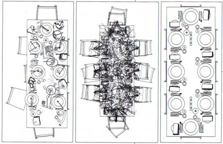
fig 3: Sarah Wigglesworth and Jeremy Till '

fig 3: Sarah Wigglesworth and Jeremy Till ‘Increasing Disorder in the Dining Table’


Architectural documentation is not confined to technical drawings however, and can be communicated through diagrams which also help with our sense of space, occupation and time. Sarah Wigglesworth and Jeremy Till’s ‘Increasing Disorder in the Dining Table’ (fig 3) is a fine example of how diagrams can help us to understand and better design space. We see that a dinner table needs space to grow as the night progresses and we understand that this happens over time. Through this work it is confirmed that the relationship between form in movement and time is crucial to the designing of inhabited space. By understanding the needs and constraints of the body we are better able to design a space specifically suited to these needs.

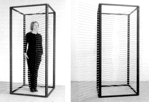
Artist Rebecca Horn explores these themes through various works that focus on gauging space by means of human proportions and movement. ‘Measure Box’ (fig 4) is a clear documentation of the physical form within space and how the body occupies it. Similarly, ‘White Body Fan’ (fig 5) shows us the proportions of the body and how they can move through space with the opening and closing of the fan. These real life artworks are far from static, and take place over time allowing us to see physical changes to the spaces that she is creating with her body. Pallasmaa describes this idea in relationship to architecture stating that ‘a building is encountered – it is approached, confronted, related to one’s body, moved about, utilized as a condition for other things…’ and therefore it must ‘record the body’s presence over time’ which further suggests that architecture cannot be depicted as a static space, but as a space which is formed by the movement of the body through time and space proving that static architectural notation is insufficient in representation and in aiding the design process.

fig. 3: Rebecca Horn's 'Measure Box' 1970

fig. 4: Rebecca Horn’s ‘Measure Box‘ 1970

fig. 5: Rebecca Horn's 'White Body Fan' 1972

fig. 5: Rebecca Horn’s ‘White Body Fan‘ 1972

References:

Juhani Pallasmaa, ‘An Architecture of Seven Senses’, in a+u Architecture and Urbanism: Questions of Perception, ed. Steven Holl, Juhani Pallasmaa, and Alberto Perez-Gomez (Tokyo: a+u Publishing Co., Ltd., 1994).

Doris von Drathen, Rebecca Horn: Moon Mirror (Ostfildern-Ruit, Germany: Hatje Cantz Verlag, 2005), p. 41-46

Images:

fig. 1& 2:
John Hill, Graphic Anatomy of Atelier Bow-Wow, A Daily Dose of Architecture, October 23 2007 <http://archidose.blogspot.com.au/2007/10/graphic-anatomy-of-atelier-bow-wow.html&gt;

fig. 3:
Nicola Twilley, Dining Disorder, edible geography, February 18 2010 <http://www.ediblegeography.com/dining-disorder/&gt;

fig. 4
Doris von Drathen, Rebecca Horn: Moon Mirror (Ostfildern-Ruit, Germany: Hatje Cantz Verlag, 2005), p. 41-46

fig. 5
Megan Trainor, Extending the Body: Rebecca Horn and Sense Data, Degenerate Art Stream, July 13 2012 <http://degenerateartstream.blogspot.com.au/2012/07/extending-body-rebecca-horn-and-sense.html&gt;